Friday, February 17, 2017

Vintage Inspired School Room

The other day I was talking with my husband about my plans for our kids' shared bedroom.  I mentioned how I wished I could find a retro pull down map like all of the classrooms back in my childhood used to have. (Side note: I also remember when teachers used chalkboards, when kids had morning and afternoon recess, and when they were allowed to do such dangerous things as jump off swings. That's right, I am older than the internet. #childofthe80s).

Anyway. I was talking about these colorful pieces of nostalgia, back when the USSR was a country (that was before my time, I'm not that old), and my husband looked over at me and said, "Wait, you want to do another room like our school room? What...did you love school or something??"

Well, excuse me kind Sir, but school in the 80's was awesome. And apparently I DO have a retro schoolhouse obsession. I am not ashamed. 

So that conversation reminded me that I never technically shared my schoolroom in it's entirety with you. I've been meaning to do so for months, but I was waiting until I found the perfect rug that finished off the space and cost about $2.50. Shockingly, nothing has shown up that falls within these generous parameters. Sooo, I decided that I can't hold out on you any longer just because of a rug. From this point forth, never let it be said that I'm not a giver.

The photo there at the top is from the listing of the house. As you can see it was brown. With brown carpet. I'm really curious what the thought process was behind matching the walls to the carpet in one of the drabbest colors known to man. I can picture the conversation going something like this: "Hey honey, what should our theme be for this room?" and, after a long minute of deep soul-searching, the other spouse replied with great excitement, "I know! Since the carpet is brown, and everyone's favorite crayon color is brown, let's do BROWN."

Let us learn from this mistake. Friends don't let friends match wall colors to carpet colors. Amen.

So, though I love old school house charm, I am still a white-picket-fence-farmhouse-cottage style girl at heart, so I needed the room to have a touch of that design aesthetic to help it flow with the rest of the house. I knew right away that would take the form of (you guessed it) shiplap or molding of some sort.

Now, real shiplap is quite expensive. And I have tried the Pinterest version of shiplap which is to cut thin luan type board into planks. But let me tell you, I must have terrible luck with the Home Depot guys who cut our boards because those planks came out SO not straight. And this has happened to me multiple times at multiple locations. So I did not want to go that route again.

Luckily another Pinterest search yielded an easier, no-saw necessary method. Those planks you see below are peel and stick vinyl flooring! All I needed was a razor blade for scoring the planks and a podcast to keep me company as I planked this entire wall myself. It's actually pretty fun, kind of like putting really big stickers on your wall. I did have to secure the planks with my small brad nailer because when I came back the next day some of the planks had given up their will to live and fell off. But other than that, it was just as easy as peeling and sticking.

When you lay floors they recommend you stagger the pattern, but since I was painting the walls and I wanted them to look like long, continuous planks, I just lined mine right up.


The next step was priming the planks. I'm not gonna lie, this step is not my favorite. But it is necessary for two reasons: 1. To give the paint something to stick to and 2. To help cover up the brown. Bye Brown!


If you're lazy like I am, feel free to just throw the paper backings from the planks anywhere. And then let your maid pick them up. Which in my case, is me.


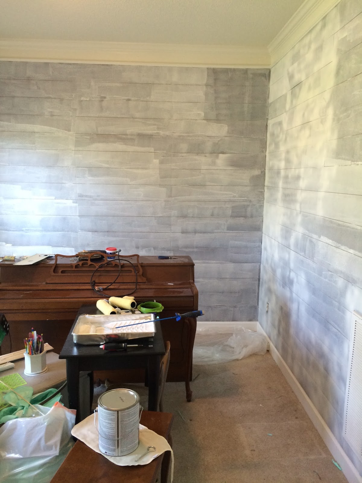
If I remember correctly, I may have done two coats of primer because the color was so dark.


And then two coats of normal old latex paint. The above photo was after only one top coat and you can see that some of the brown was still visible. Don't wimp out and give up at this stage and tell yourself that the brown will never be gone. That the brown has cursed you. That you are fighting a losing battle, because brown will never die. Take a break, go and eat some ice cream and cry yourself to sleep. I don't know if that will help. It's just speculation. Ahem.

But I am here to reassure you that after all of that painting, your brown will finally disappear and you will be left with this:

Beautiful white walls. *chalkboard sold separately


And now for the beauty shots. I didn't get my old school maps (pun intended), but I always have my globes to keep me happy.


Cuckoo clock with incredibly loud cuckoo to keep those kids on task and awake? Check.


The old chalkboard was found at Goodwill for $3.


But my favorite part are the gooseneck lights. We don't tend to hardwire stuff around here because I like to switch things up so often, and I've become a bit ingenius with hiding most of the cords. This time with a ginormous chalkboard. So if you have a lamp cords that show, I guess that's always an option ha! *in all seriousness, you do know there are amazing cord covers you can buy right? Plus you can paint them to blend in with your wall color. Link here.


Ah yes, and here is the other side. The camelback sofa where I lounge while keeping the kids on task. A schoolmarm's mom's work is never done. I do wish the sofa was a brighter color, so I'll probably come back to that with some crazy hair-brained scheme. Nothing is safe from me. I've also considered painting the hutch, but my husband has sort of put his foot down on that one, and since it would take me a week to paint it, I've been sort of happy to give in on that front.


These lights were an Amazon find, and were the cheapest I could find said gooseneck lighting. We did have to rewire them to switch them to plug-in lights, but it's actually a pretty easy thing to do!


Ah school supplies. Let's just end with these, shall we? Because nothing is better than 30 brand new sharpened No. 2 pencils ready and waiting for composition books. Am I right??

Thanks for coming along on our little school room tour, you've been great. Class dismissed.

Thursday, February 16, 2017

Master Bedroom Makeover with a side of RISK

Anyone else feel like they are just barely recovering from the craziness of Christmas and New Years and cold & flu season??

I feel like a blinked (or sneezed may be more seasonally appropriate) and looked at the calendar and it was suddenly the middle of February. How in the world did that happen?!

But, I have not been idle in that time. The one good thing about being a bit stuck indoors in that suddenly you have to clean and organize and finish the house projects that you have been meaning to get to for ages. Also, please tell me I'm not the only one who watched the documentary The Minimalists and felt the instant and profound urge to throw away all of their possessions except for two outfits, a pack of toothpicks, and a hot plate? It was my own Marie Kondo-on-crack moment, and overall I think it did me a world of good, especially since I've been needing to purge with our move.

That being said, I finally got around to making over a few rooms (all on a skinny post-Christmas budget), and I thought I'd show them off a little.

Today's room makeover? The master bedroom!

First, what the room looked like when we bought it.


 As you can see, it was a dark sage color that though not terrible (but not great either), was still definitely too dark for my white-wall-loving soul.


The first thing we did was paint the walls my favorite creamy white (Bistro White by Valspar at Lowes). After living with it for a few months, I felt the need to spice things up and I did something risky.

At least, according to my husband, it was living life on the edge. And a small part of me has to admit that I wasn't 100% sure it would turn out. But one day I decided life was too short to play it safe and I did it while he was at work. Ha! The happy ending is that he came home and loved it, and I loved it too. So what did we do that I'm being so amazingly cryptic about?

I drew "faux shiplap" on our walls using pencil. Oh yes I did.

Want to see?


Here is a close up of the lines. You can hardly tell these planks are made with just a level and a good old number 2 pencil!


I'm such a perfectionist I almost couldn't post the photo above because I didn't tie the basket ties for some reason, but oh well!


 So there you have it! A simple makeover that required just some paint, some patience, and a little bit of willingness to think outside the box. Skinny budgets do not equal skinny style in our books!


Saturday, November 12, 2016

Laura's Kitchen Story

Have you ever read the book, If You Give a Mouse a Cookie? If so, you probably know that the premise of the book is that if you give an inch, they'll take you a mile.

Well, that sort of has been the case with my friend and E-design client Laura. Only she's not the mouse in this equation, I AM. :)

Let me back up a bit. Laura contacted me a few months ago about wanting to make her home feel less like just a place to be, and more like a home that really reflected her and her family. Her style is a very beautiful mix of traditional architectural elements like beadboard and molding, combined with bursts of cheerful color that keep the space from feeling too stuffy or old fashioned. She also loves a coastal feel, without getting too literal (no fake starfishes need apply).  I give nicknames to all of my clients' styles, and I dubbed Laura's style Fresh White Hampton.

She wanted to start with her family, living, and mudroom spaces. I was very happy to comply. But then, she offhandedly mentioned that someday she would like to revamp their kitchen too.

Oh boy.

So, in my defense, you see that she opened that can of worms herself, right?? Haha!

No, but honestly, I understood and wasn't going to give it another thought, but for some reason, after looking at the pictures of her kitchen and dining area and what frustrated her about those rooms (and the front family room) I realized that what was really frustrating her was...her kitchen.

Sometimes helping interior design is also identifying where people should start. Now to be fair, a kitchen is a huge undertaking, and I can understand why it wasn't on her list. Automatically we just know that kitchen makeovers are going to be pricey, so without realizing it we push those "wishes" back to "nevers" because we don't want to get our hopes up or feel frustrated with what we have.
I SO get that!

But after I looked at her kitchen and what she said was frustrating her about the rooms surrounding her kitchen, I realized that it wouldn't make sense to do over those rooms without addressing the room that connects all of the other rooms. Even if she couldn't do it first, having a plan in mind for it eventually would, I thought, help give her focus and excitement to finishing those other spaces--knowing that she was getting furniture and such for a space that would work once the other space was renovated.


Let's see a few pictures and I'll tell you how I came to that conclusion.

Laura is like me, she LOVES the light. This room is at the front of her home and that front window is HUGE and beautiful. You'll notice her kids love to play in the corner and she entertains friends with their kids in this space quite often as well.


Here is the room from the other direction.


Behind this long wall is her kitchen. This is an issue for a couple of reasons.


1. It is cut off from this front room where her kids play and her guests sit. So when she is in her kitchen, she feels too separated. I would too.


Her dining room is pretty and right off the kitchen as well. Lots of great light with the two windows.


 This wall between the kitchen and dining room is our nemesis too. It blocks off tons of light from reaching that kitchen.


This is the "eat-in" portion of her kitchen. But it is so small and dark that she can't use except for a kid play area.


The offending door and strangely short window....


You can see that Laura's cabinets are actually in very nice shape--the door style is pretty, and granite is always nice! But you can also see that this portion of her kitchen is very cramped, and the kitchen overall is a little dark (the cabinet color and backsplash are probably contributing to this feeling).


 This is what is on the other side. Remember that long wall behind the couch in the family room? This is what is on that wall.


Again, these cabinets could look great updated with paint, and she has stainless appliances on this side, all pluses!

So without her knowing, I started playing around with her kitchen with my partner Katie one afternoon. We both realized there were several ways she could make over her kitchen, that could actually be cost effective. So....even though Laura hadn't asked for a kitchen layout change, I emailed her and told her that I had done one and she was free to ignore it and it could just be for fun if nothing else.

She was a little surprised at first I think, but once she saw the idea, she started getting excited, and together we played around with the layout until we came up with something she was completely excited about--not just because it would make her kitchen work much better and be more to her style, but because it fixed the issues she she had with all of her other rooms!

Let's look at one of the first versions I did for her.


In this version we just took out the wall between the dining room and the kitchen. Since this was where her stove currently is, we had to play musical chairs with a few other items...like her door outside. Since she already had a large window in the dining room, we knew it wouldn't cost as much to change that from a window to a door! Cost savings one (although we thought a set of french doors would be beautiful, so that would add some cost), but the increase in light would be amazing.


In this version we walled up the door and extra window and put her stove in its place, while adding additional cabinets on the wall that used to be her eat in kitchen.


Trying to save money, we suggested that keeping this wall here originally.


Once Laura and her husband saw these plans (which could be executed using their current cabinets, plus adding a few and having them all painted to look uniform)--and would only require a few "big" changes (like moving one wall and a gas line which isn't bad), they started to get excited and see the possibilities.

But they still were bothered by that wall being in the way. I told them I could remove it in my layout, but it would probably be expensive as I was guessing it was structural.

I then had another idea come to me, what if we left a couple of columns (not roman columns or anything cheesy like that!) but basically exposed support beams sort of thing to keep the structural support (and it may still require a beam above), but it should cut down on the cost!

So I did a mock up of that and they loved it!

 Now Laura would be able to see her kiddos playing, have tons of extra light, but still have her sink looking out over the backyard. From this vantage point you can see we kept out the wall between her dining and kitchen. You can see our plan for her mini playroom space in the corner. :)


 We kept the french doors idea.


As you can see, the design process is exactly that, a process! Now that Laura has decided on what she wants to do with her kitchen in the future, it has helped us to narrow down the proper sizing of couches, and all of the other furniture. It has also given her a sense of excitement knowing that many of these changes are actually within reach.

And that's why we love doing what we do! We'll keep you updated as Laura makes progress on her spaces over time. Can't wait to show you our plans for her living room in addition to the ideas for her mudroom and laundry we are working on as we speak!


Thursday, November 10, 2016

One Room, Five Rugs

The other day I was sending a bunch of inspiration boards out to clients, and realized it might be neat to share some of these "in process" boards.

One thing that I think people worry about is how helpful design work would be long distance. Right now I have two clients in New York, two in Utah, and only one locally! While it does take a bit of work up front from my long distance clients--getting me measurements and answering questions about style and room usage, I think E-design works really well because it goes at whatever pace people need it to go. 

Often the folks I work with will email me postings from craigslist--so my responses have to be as quickly as I can make them. Other times they need time to send off for fabric samples, or go into a brick and mortar store to sit in a variety of couches. Because it is at their pace, it makes it an easier arrangement for both them and me! Flexibility, creativity, and patience are all keys in making a space on a budget, and E-design help is really conducive to that!

Are you convinced yet? Oh good. :) Anyway...one way that I love helping my clients to make decisions is to take their inspiration boards, and switch out key pieces. Since it can be difficult for people to picture what their spaces would look like with different rugs or furniture, the Polyvore boards work wonders.

Take the boards below. My client Kim found an amazing tufted blue couch on craigslist after we searched for weeks. She was able to see past the skirt that aged the sofa, and once she got it home took it off. I want to show her and her hard work off. Such a difference with such a small change!


Before, with the skirt still in place at the bottom of the sofa


 After, skirt removed! Instant update! And it was a fantastic price!

Once she found her statement piece in her room, we knew the next big purchase (besides her other couch) would be her rug. 

Now let me just take a second here to talk about how difficult finding the right rug is for EVERYBODY. Rugs are hard! I've bought my fair share of rugs that I thought I would love in my space only to get it home and think, wow...that's really not the look I was going for. ha! They can be tricky to visualize in the room! This is where inspiration boards are worth their weight in internet gold. I now do this for myself to save from the dreaded RR--- rug regret. :)

So want to see some options we looked at for Kim?
 Kim's style is an updated farmhouse feel, with blue and orange and white. All of her inspiration rooms had several things in common, one of which was very light rugs on the floor.

When I told her that, she was both surprised and a little...worried. :) She has young kids, and she faces the dilemma that all moms face. She wants it to look nice and to have a beautiful space...but light rugs and kids is pretty much a dead on arrival idea.

So, we looked for things that would still translate as light, but hide dirt. Above, we tried a jute rug with light patterns. Texture, but still dirt hiding.


This option was a greige tone to go with her wall color and pull out the neutral tones of the couch as well.


From far away this rug looks almost cream, but it is actually a mottled oatmeal, that would be both soft and, you guessed it, help camouflage dirt.


This option looks like it has a fair bit of white on it, but up close it is actually quite variegated, so dirt would hide pretty well!

This rug option took a much more traditional route, but by keeping to patterns and soft blues it would keep the room light feeling and stay kid-friendly.

So, these are just a few of the many options I emailed Kim. Isn't it fun to see how different the room feels with just the change of the rug? And it saves all of the heavy lifting and stress of buyers remorse. :)

Kim is still weighing her options, and waiting to see what great sales Black Friday brings on my recommendation. I wait to buy all of my large rugs on Black Friday from Rugs USA online because they drop their prices so low and their quality is great! So hopefully we will find something before then so she can pounce on a good deal!

All this to say, if you're a visual person, (or even just a nervous decorator) our inspiration boards can help you see what your room can be with minimal furniture moving required! So, if you have a room that needs an overhaul, or even just an extra pair of eyes for a spot that has bothered you for years, email us, we'd love to help!